Digital Signage Takes a Cruise on “Oasis of the Seas”
 Royal Caribbean's Oasis of the Seas
Photo credit: Royal Caribbean International
The Oasis of the Seas, commissioned by Royal Caribbean International (Miami, FL) was the largest cruise ships in the world until a sister to the Allure of the Seas was built slightly larger and grabbed that title with an extra 2-inches in length. In a classic comparison, if the Oasis was placed vertically (1187 feet or 361 meters) next to the Empire State Building (1250 feet or 381 meters) and measured against it, the Empire State Building is only 63-feet longer that the Oasis. Floating in the sea, the Oasis is about the length of four American football fields.
Royal Caribbean's Oasis of the Seas is one of the largest cruise ships in the world with 17 passenger-accessible decks incorporating 2800 cabins to host at least 6400 passengers.
Our task is not to advertise the luxury and comfort of cruises but to show that the ubiquitous digital informational environment intrudes into all parts of the world, be it on land or at sea.
Oasis: A City unto Itself
In terms of the Oasis guest services, it has 17 passenger-accessible decks, with 2800 cabins to host at least 6400 passengers. To make passengers feel more at home on the ship, it's overall space has been divided into seven distinct themed areas or neighborhoods including Central Park, Boardwalk, (with an operating carousel), the Royal Promenade, the Youth Zone, Vitality at Sea Spa and Fitness Center and Entertainment Place with award-winning entertainment, nightclub, food, and retail venues. Being one of the largest cruise ships in the world, it became a concern of Royal Caribbean that because of its size, passengers could have difficulties in orienting themselves on each deck and of getting around from deck to deck.
Once fully boarded and under way as passengers begin to explore their new “digs” one could argue the single most important part of the ship's services (beyond the zip line, the mini golf course and the ice skating rink) is the wayfinding system that allows its guests to find all of these great ship board destinations and attractions. To implement a contemporary way finding system, it was developed in tandem as both a static (print) system created by TGADesign, and an interactive digital system, designed by Four Winds interactive.
40 000 Signs on One Ship?
 Etched glass signs by each elevator
Photo credit: TGADesign
TGADesign (Coral Gables, FL) is an internationally known environmental signage and graphic design firm involved with wayfinding, place-making, and environmental signage. The company has a long standing relationship with Royal Caribbean and has designed interior signage systems for both the Royal Caribbean and Celebrity Cruises cruise liner fleets.
Etched glass signs by each elevator lobby offer a deck-by-deck overview of what's where on the ship. The ubiquitous ship's cut-away profile and You Are Here indicator appear on every applicable sign to help orient passengers as they move around.
“We've been designing and placing signage and graphics on board Royal Caribbean vessels since 1981”, said Tom Graboski, president of TGADesign. “For the Oasis's signage program, it required at least 40 000 static (print) signs which were distributed throughout its 17-decks (everything from a simple EXIT sign to the large format marquees on its indoor theater).”
“40 000 signs on a single cruise liner is an enormous amount of signs, but one has to put it in prospective,” says Graboski. “This is one of the world's largest cruise ships, so there's a big need for signage all over the ship. Most of the signs are very small, and most of them (75%) are in the passenger staterooms (2800 rooms), of which each averages at least ten (very small) signs per room. Other types of signage include general information and regulatory alerts (20%), Venue ID spectaculars (5%), and way finding (5%).”
Despite the enormous volume of signs and that some of it was even multi-lingual, a common element that spoke volumes and used no text and yet was understood by all passengers was the use of icons and symbols as part of the sign messaging.
Picture Perfect Icons
 Wayfinding in its best form, a succinct graphic, clearly showing an overview of its defined
Photo credit: TGADesign
Icons are a visible “shortcut” to quickly communicate ideas about safety or where things are and where venues are located, There were both common icons such as the male/female symbol (restrooms), silverware (restaurants), martini glass (bars), and as well, custom icons specific to certain ship destinations (ship neighborhoods) and safety concerns (deck slippery, no running). The use of icons found its way on a lot of signage from wayfinding to even the elevator panels next to certain buttons.
The Oasis wayfinding design not only depended upon signs, but included the use of several color schemes. The neighborhood plan (giving sections of the ship 'names') helped passengers to think about navigating around the ship in more destination-oriented terms then just a deck, section and room number concept. Ship orientation was also enhanced by a specific color scheme to define locations and ship sections; here the forward end of the ship was colored red and green for Port and Starboard, and for the aft section, blue and yellow for Port and Starboard. This color scheme was very predominant in all the ship's digital display icons and ship deck maps as well.
Complementing the Oasis static wayfinding system was an innovative interactive digital sign system that showed wayfinding and ship activities at the mere touch of a screen. Although conceived by TGADesign over ten years ago, its final complete implementation has just begun starting with the Oasis installation as represented by the total integration of such a system by Four Winds interactive.
Digital Signage Finds the Way

Wayfinding system digital signage
Photo credit: Four Winds interactive
Development of the interactive wayfinding digital signage program was awarded to Four Winds interactive (Denver, CO), a software company specializing in interactive digital signage solutions for retail, hospitality, airport arrival/departure signage, wayfinding and digital menu boards.
The Four Winds interactive wayfinding system essentially acted as an on-board digital concierge giving guests easy ways to navigate around the ship and to learn about its daily on-board activities. Note the Dashboard at the bottom of the screen includes a choice of language, and in lower right corner, for wheelchair bound passengers, a touch point to reorient the screen for ADA ease of use.
Creation of the digital signage was incorporated in two phases; the first part was a passive overhead digital screen deployment of at least 150 LCD screens which were located throughout major passenger traffic areas of the ship. These screens displayed a series of continuous messages about guest services, sailing events, production show times, and shore excursion activities.
The second part of the digital signage program was its interactive, touch screen wayfinding and event activity information system. For the interactive display system, thirty-six 46-inch Samsung vertical LCD screens and eight horizontal screens were installed at specific points throughout the ship.
The basic wayfinding content was designed, stated senior FWi program manager Heath Burr, with different sections of the screen layout devoted to specific ship services. “The Oasis interactive displays essentially acted as an on-board digital concierge giving guests easy ways to navigate around the ship and to learn about its daily on-board activities. The main feature of that service was an interactive way finding system that would allow passengers to enter their room number into the display, which caused the screen to show you were, and where your cabin was and how to get there.”
The dining room display presented a list of the on-ship eating places, their locations, and even better, an occupancy meter indicating how long to be seated at that particular dining space. The indicator graphic looked like a thermometer which was color-coded, and depending on how filled up it was, indicated how long before you could be seated.

The dining room digital signage
Photo credit: Four Winds interactive
Once the room finder was in place, other features were added including another navigating system that gave directions to all venues and activities on the ship There was also a dining room option button which presented a list of the on-ship eating places, their locations, and even better, a 'wait time' indicator letting you know how long to be seated at that particular dining space. The indicator was a visual graphic that looked like a thermometer icon. The icon was color coded, and depending on how much it was filled up, indicated how long before you could be seated. Other touch screen features included a display that gave you an hour-by-hour outline of the different activities for the entire ship on that day.
Further navigational guidance provided a “Map It” feature that presented guests with step-by-step directions to their ship-board destinations. To make navigation easy, the directions were keyed against the ship's surrounding venues: “Take elevator to Deck 6,” Turn right at Seafood Shack, etc.”
To handle passenger requirements of disability and foreign language, special features to meet those needs were also provided. Thus the interactivity display was ADA (American Disabilities Act) compliant, as wheelchair guests could touch the wheelchair icon, enabling the entire button display scheme to reorient itself to the bottom of the screen for easier access to using the different button selections. As this was an international cruise vessel, the content could be viewed not only in English, but Spanish, French, German, Italian or Portuguese. At the bottom of the display was local time, day of week of cruise and ship location.
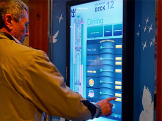 Digital signage onboard the Oasis: checking the interactive dining menu for a good place to eat
Photo credit: TGADesign
Display screen orientation was also critical in integrating shipboard signage. Whenever a deck plan was displayed, the bow of that deck plan should always point forwards in the same direction of the actual bow. However in the case of the digital interactive signage, in many instances the LCD screens were set in the portrait (vertical) format. When that happened, the orientation of the ship outline on the digital screen was changed, depending on the ship's location.
Thus in front of the ship, digital signage had the Oasis's vertical interactive screens with the bow pointing up. In the aft part of the ship, the displays had to have the interactive screens with the bow pointing down because the screens were on the back walls. This was a critical orientation for passenger navigation, when the info on the screen referenced a door sign or ship venue and said the door sign was on the left, you turned left and went in that direction and there it was. For maximum passenger access, the interactive displays were located by the main elevator lobbies on both the Port and Starboard sides of the forward and aft parts of the ship. Thus there were four interactive screens per deck.
As Burr noted, Royal Caribbean was happy enough with the interactive screen results that it became a strategic competing feature in how they marketed their cruise line offerings. The interactive touch screens were so well received by guests that an identical digital sign system has since been added to the next newly commissioned cruise liner, the Allure of the Sea. And in regard to other Royal Caribbean cruise vessels, the company has also begun to retrofit other ships in their fleet with a similar interactive digital sign system.
“As for the passengers,” Burr stated, “they just love it. It was the number one rated ship feature with the highest positive feedback comments. Many passengers likened it to a giant phone.” Once the Oasis was enroute, passengers took to its interactive wayfinding system pretty quickly and after that it was pretty smooth sailing from one part of the ship to another.
It is obvious that this video system will continue to expand and acquire new functions. For us it is important to stress that digital technology is becoming ubiquitous and we can hardly imagine any public or socially-related project without the informational support of digital video screens.

