Putting the Romance Back into Airport Travel: New LAX Terminal
There was a time when going to the airport was an enjoyable experience, the commencement of travel to a distant city or resort destination with the promise of courteous service and comfort, and even the wonder of air travel. In today's post-9/11 world, navigating an airport check-in is a trying experience from ticketing and check in being cleared by the Transportation Security Administration (TSA), finding your gate and hoping your flight will be there to meet you. No comfort and little in the way of joyfulness here.
In an effort to transform the airport departure and arrival process into a more positive passenger experience, the Los Angeles World Airport (LAWA) which operates LAX International, utilized the creative pallet of environmentally integrated multimedia and stunning visuals to create a series of monumental LED media displays within the Tom Bradley International Terminal. These thematic displays have been deployed around the Terminal's “Great Hall”, Concourses and Entry Light well, to engage with passengers in a dynamic environment designed to celebrate the travel experience and the destination cities served by LAX.
 |
 |
| The Welcome Wall is intended to provide a one of a kind greeting and portal experience for arriving international passengers to Los Angeles Photo credit: Sardi Design |
For those departing the LAX International Terminal is the Bon Voyage Wall that offers a fond farewell as passengers prepare to board their plane Photo credit: Sardi Design |
MRA International's Dr Mike Rubin was project director responsible for conceiving the $40 million program and developing a business platform to support the project. Environmental Media Architect, Marcela Sardi of Sardi Design was designer of the architecturally integrated media environment, which included seven iconic features and a program for over 60 future installations, of moderate scale.
MRA and Sardi worked over a two year period from 2009-2011 to develop an integrated approach to deploying the media within the terminal, designing the architecturally scale media structures and then assembled and co-directed a world class multi-disciplinary team of content producers, technology consultants and systems designers to develop the advanced show control system and over 5 hours of content for the features.
In establishing opportunities for deploying media at Tom Bradley, MRA International and Sardi Design coordinated their work with the designers of the new terminal, Fentress Architects (Denver, Colorado) and Los Angeles World Airport Development Group ADG, with the goal to seamlessly merge the displays within the terminal building surfaces and structure, with specific locations selected to align the media with key moments in the departure and arrival itineraries.
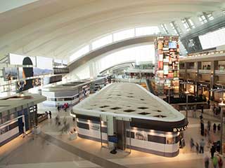 New LAX digital media terminal
Photo credit: Sardi Design
MRA International and Sardi Design in collaboration with Fentress Architects and the Los Angeles World Airport Development Group ADG, seamlessly merged the media displays within the terminal's building surfaces and structure, with specific locations selected to align the media with key moments in the departure and arrival itineraries. In this view of the terminal, the Story Board is seen on the left side of terminal, and on the opposite side, is the clock tower and above and behind it, the Flight Information display (FID).
“Travel is experience-shaping because it relates to four of the quintessential aspects of the human experience: the destination, the journey, time away from the familiar, and the stories that result” explained by Mike Rubin, principal of MRA International. “So the opportunity to deploy media to reveal these often subliminal aspects of travel became the basis for the design of the feature identities and the themes for the content”.
MRA developed the program for the seven features, which Sardi then designed into a paradigm shifting set of media icons: redefining dynamic signage technology to become what can best be described as a new form of medium. “When we began working with the manufacturer and contractors there was a constant reference to 'the signs” said Sardi, “but today if you ask anyone visiting the Terminal about the features, they refer to them by their names, they never think of them as signs”.
Defining the Passenger Travel Experience
The linear progression of traveling through an airport is of course based on a logistical sequence over an experiential one. MRA and Sardi worked to introduce a sense of engagement, surprise and delight into the passenger experience by strategically locating each of the media features at key points along the passenger itinerary. Beginning with a unique-to-LA send off moment just after departing passenger’s clear security to an iconic Time Tower, which serves as both orientation point and as historic reference to the clock towers that served as meeting points in the grand transit stations and airports during the golden age of travel.
“Our challenge from the LAX executive team” said Rubin, “was to create an enhanced guest experience for the passengers through media which was “tuned” to the airport environment, in essence the opposite of a visually noisy “Times Square” environment; and of course to build a robust business platform”.
Sardi, who was also the creative director for producing over 60 pieces of thematic content, summarized the project, “as an effort to recreate the romance of travel”.
It is clear when visiting the terminal that the creation of these airport media assets have indeed been transformed as something beyond signs. They have indeed become, as Sardi describes them, “mediums”, each with its own unique identity formed by virtue of how each medium functions within the terminal. As a result these mediums have taken on specific identities within the Terminal signaling the moments of the traveler's journey:
- the Bon Voyage Wall which sends the passenger off on her journey;
- the Welcome Wall which greets arriving passengers;
- the Story Board designed as a symbol of Los Angeles, the capital of story creation;
- the Time Tower as the central icon of the space;
- the Destination Board which transforms the traditional flight information display board;
- and the Concourse Portals which signal the final transition as passengers head out to departing planes.
The development the “Integrated Environmental Media System”, so called because of the integral nature of the media within the environment, involved a partnership of several distinguished design companies working under MRA/Sardi's direction including systems designers, Smart Monkeys Inc. of Miami; Executive Content Producer, Moment Factory of Montreal, Canada, Content Producer, Digital Kitchen of Los Angeles; and Electrosonic Inc. (also of Los Angeles) as systems integrator. Daktronics as LED screen manufacturer worked with Sardi to develop several unique features including the tightest LED corner tiles in the industry and a 200-foot long crest of creative LED’s.
To ensure that the design team shared a common vision Sardi created a 300 page Content Guideline which described the identity of each feature, content themes that would support each identity, film modalities to be used on each feature from “Jump cuts to cross fades”, and the goals for coordinating the media across the day and night to create a synchronous environment.
Creating New Mediums
Each of the features was designed as socially conceived interfaces or what Sardi refers to as a Type 2 Interface. “Type 1 interfaces are digital media designed for public messaging (signs). Type 3 displays are personal devices” explained Sardi. “Type 2 interfaces are social media which historically ranged from the television to the cinema screen, but the Type 2 interfaces have lost their valence, their ability to support social engagement. That was the opportunity at LAX, to re-invent social interfaces that reinforced both a sense of place and the sense of a shared moment”.
An example of this social aspect can be found in the centrally located Flight Information Display (or FID) in the Great Hall. Sardi and Rubin saw the opportunity to develop a social medium by extending the traditional display architecture to include two interfaces fed by live data and trivia from the destination cities as they roll up on the display. As described by Sardi, the FID was transformed from an information board to a generative medium in which content evolves with streaming data creating an endless series of canvasses.
“As a team we worked to re-invent the Flight Information Display (FID) that provides the flight ID, gate location, departure time and status,” said Rubin “and created a medium that interprets the travel data into a visual fabric revealing both imagery and live data from the destination cities. The Destination Board acts a data cloud that monitors live and historic information (weather, local cuisine, current holidays and iconic landscapes) presented as a series of visual compositions”. Moment Factory of Montreal as executive content producer, and Digital Kitchen of Los Angles as co-producer, worked with Sardi and systems designer, Smart Monkeys of Miami to develop the novel approach.
Time Tower as the Clock of the World
 LAX Time Tower
Photo credit: Sardi Design
In another transformation of a traditional feature, MRA and Sardi Design used the temporal experience of travel, as a time away from the normal time set by familiar routines to reveal a core phenomenon of the travel experience. The design involved a re-invention of the “clock tower” as another social medium. The Time Tower, which was built on, a structural envelop around the terminals’ elevator tower, is a 72-foot tall, four-sided “ode to the mystery of time”. The challenge that MRA and Sardi put to Moment Factory for creating visual content was to imagine not a clock tower, but a medium for expressing time, as if created by a modern day Galileo.
“When you're traveling your sense of time changes, you see things differently and time seems slower as you take in the new experiences of your travels,” said Rubin. As Sardi pointed out, “not only does the Time Tower tell time, but more than being a clock tower, deals with time as a universal experience”.
The content designed to express this concept required over 3 months of design workshops between Sardi, MRA and Moment Factory. The resulting “kinetic structure” is a dynamic piece of media architecture consisting of what appears to be a lattice of moving ribs driven by the clocks of destination cities across 24 time zones. The ribs open to reveal windows into time, from slow motion vignettes of scenes from destination cities to mesmerizing atmospheric content expressive of time as experience.
The Time Tower plays the part of the traditional clock tower, as well, with a clock face which is synched to the Airport’s universal clock highlighted by hourly 'Clock Events' from a spectacular homage to Hollywood director and choreographer Busby Berkeley to a take on the era of silent films.
At its base, a layered surface of a glass diffusion panels was placed in front of an interior wall of LED tiles to lessen the pixilation effect of the LED imagery as terminal visitors move closely past the Time Tower. Furthermore, the base was developed as an interactive medium by Moment Factory utilizing its X-Agora technology to support MRA/Sardi's guideline for an embodiment of time as both transforming and transformable. Close up visitors can create a variety of effects by waving their hands to transform the content with the resulting patterns traveling beyond the base to the iconic media surfaces above.
Once Upon a Story
 LAX Story Board
Photo credit: Sardi Design
The Story Board was also conceived as a social medium. Developed as a 3-D interpretation of the storyboards used throughout LA's creative industries, this medium was designed with 8 separate displays distributed across the expanse of the Hall using a space frame structure. Mohamad Alkayer and Peter McCleary of the University of Pennsylvania consulted Sardi on the structure. The displays literally appear to float across the west side of the Great Hall. The Story Board is designed for what the team came to term “ambient narratives”, story-like vignettes that are revealed through multiple perspectives to support the diverse viewing points of passengers at various locations within the Great Hall.
North and South Concourse Portals
 LAX Concourse Portal
Photo credit: Sardi Design
The Concourse Portals each consist of ten 28-foot tall vertically stacked columns of LCD displays. The columns form composite images that are themed around the art traditions or the destination cities boarding at the gates, ranging in expression from expansive water color murals to intricate mosaics. As passengers leave the Great Hall en route to their departure gates, and walk through the 120-foot long row of media columns their movement triggers the mosaics to shimmer and flip, and the landscapes of coastal cities to ripple with reflections, creating a shared experience of delight in what was once the final step in a structured logistic.
Stakeholders Manage the Medium
In a further enhancement of the terminal visitation experience, LAX is also seeking ways to generate additional revenue streams from the media displays. Using a naming rights convention similar to what is done at sports stadiums he has worked on. Rubin worked with the LAX’s Executive team and Board of Airport Commissioners to develop the first Sponsorship Program in a US Airport. LAX International Terminal will offer brands the opportunity to entitle each of the Terminal media displays. This in turn, allows specific brands to connect with the displays to further enhance the passenger's terminal experience by providing new content to each feature.
At its recent opening, passengers moving through the new Tom Bradley International Terminal were visibly engaged, stopping to take photos of the media features and interacting with the responsive surfaces of the Time Tower and the Concourse Portals.
It was a convergence of the medium and the message, as a celebration of travel. As Sardi exclaimed, the best of all the Terminal activities was the smiles on all the visitors’ faces. People enjoying themselves while waiting for their flights - imagine that.

